I recently was interviewed by Anthony Nelzin-Santos from the iGeneration portal about my usage of Apple products in art-making. The original article (in French) is published here: iGeneration.
They were gracious to write it up for me and allow me to post an English version too, so here it is for you to enjoy. Thanks!
You come from a fairly technical background. How did you go from electronic engineering to art?
When I was in high school, I was interested in computer graphics because I was designing websites and icons for my software. I heard about an event in the neighboring school where you could test Wacom tablets. Because the tablets were quite expensive at the time in Poland, I went with my friends to try them. When the presentation was finished, we were able to sit at the computers and try the graphic tablets by ourselves.
So I sat down with my friends, and I started drawing stuff while explaining what I knew. After a while, I turned around, and there were 20 people behind me listening and looking at what I was doing. The guys from the Polish reseller were like: “We can sell these things, but we cannot use them. Would you like to work with us?” Sure! So that was the first transition point from programming and electronics to drawing and using my technical knowledge to support what I was creating. So it flipped.
Nowadays, you are using an iPad with an Apple Pencil. You’re using the smaller model, aren’t you?
I have the big one now.
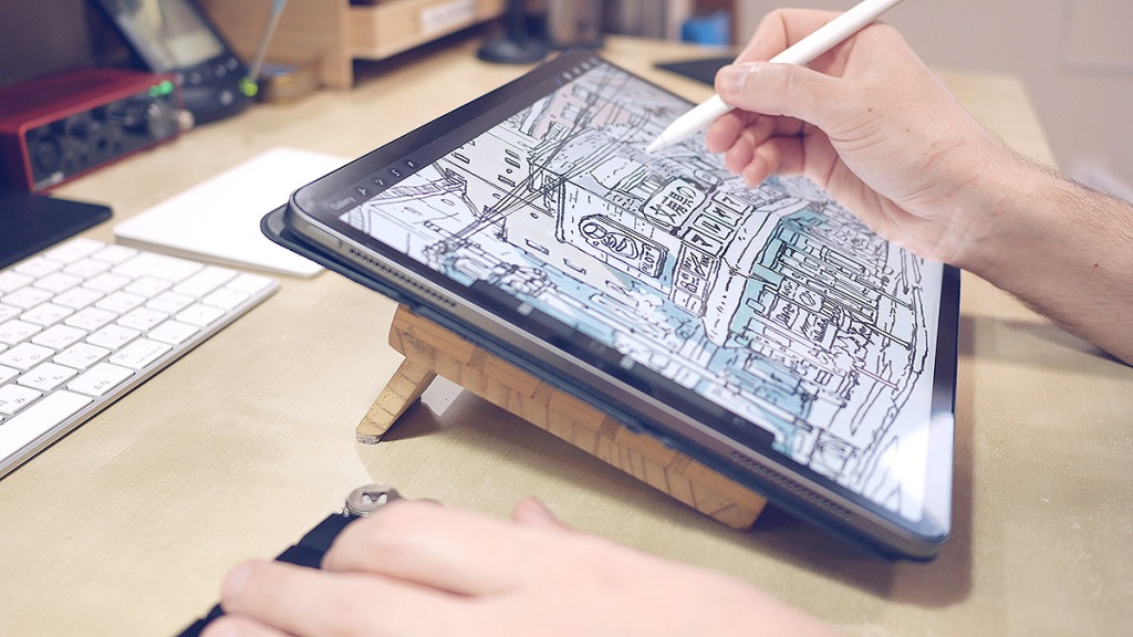
Why did you switch?
I switched because sometimes, I like to work with the iPad only. I like having more screen estate to put a reference photo on the left side and Procreate on the right side and still have enough space.
The 12.9-inch iPad Pro is almost like an A4 piece of paper. Do you like this format and would like something bigger?
If there was a bigger one, I’d probably go for it because I love the ability to have Procreate on fullscreen and a reference file somewhere. If it were like the 16-inch MacBook Pro, for example, that’d be nice. I’m not going to put it into my bag and be like: “oh, let’s go somewhere!” It’s my everyday drawing tool. It sits on my desk. I use it mostly at home. So if it were two or three inches bigger, that’d just be more screen estate for me to use.
In some of your videos, you use a sleeve on your Apple Pencil. Why?
I’m used to the Wacom stylus, which is quite thick compared to the Apple Pencil. I don’t like the Wacom stylus because it’s so wobbly. I actually prefer the Apple Pencil a lot. But when you use it for 10 hours straight, the smaller diameter makes it a bit hard-wearing on the fingers. I’m used to using regular pencils, which are even thinner, but the Apple Pencil requires more pressure. When I use a tool that requires pressure, I like it to be a bit thicker.
Can you explain how you use your macropad with the iPad?
Currently, Procreate doesn’t have any options to modify its keyboard shortcuts, which is a bummer, so the keys that I use the most are really spaced out on a regular keyboard. You have the brush size here and the move tool over there and the color picker somewhere else. So your hand always floats above the keyboard.
This tiny keyboard uses an Arduino Pro Micro-compatible chip. When you plug it through USB-C, it’s seen as a drive that contains a text file that you can use to program shortcuts without the need to flash it. I programmed the keys so that just my fingers rather than my whole hand move. I can just use my thumb for color picking, for example. I can also program macros on this, so I can use “copy-paste” or “paste in place” with only one key.
And you’re fast. It seems like second nature.
I’ve been using custom keyboard layouts for painting on the Mac for a long time. I’ve had a USB numeric keypad that I reprogrammed with [Karabiner Elements][1], so I always had my Photoshop keyboard under my left hand. Another upside of this is that you still have the default keyboard shortcuts on your regular keyboard, so that if someone else comes to your computer and wants to do something, all the shortcuts are in the right place.
The same way your tech is responding to your art, your iPad is complimenting paper. Can you talk about a little bit about that?
I use computers a lot, and I use traditional methods a lot, so they naturally overlap. I prefer sketching with a sketchbook and a pencil. But I might want to test the colors using my iPad, so I’d take a picture of the sketch, I’d edit the photo in Pixelmator so that the background is a crisp white and the line is a nice black, and then I’d import it into Procreate and make it look like something I can work with. I’d then go back to the analog process, and I’d do the line art with my fountain pens, for example. I could scan it and color it digitally or paint with watercolors and then scan it and correct it on the computer. So it is a mixed process!
The greatest trick I learned is that when you draw with a pencil and then paint with watercolors, sometimes the pencil ends up looking gray. You can’t see the lines clearly, and the picture becomes muddy. But if you scanned the line art beforehand and superimpose it on the finished piece using Photoshop, it suddenly gets sharp, and it really pops. So I try to use many of these tools to my advantage and get the best of both worlds.
Are you planning on doing more fully digital projects?
I just like drawing and painting by hand, but sometimes the digital process is better because I can dial in the atmosphere and the details. With the layers, I can adjust things that are hard to get right with watercolors. You have to be precise with watercolors to get a nice distance effect or just the right amount of blur. But even in digital paintings, I try to be as loose and natural as possible because digital often causes me to get detailed and stiff, and precise. That kills the fun in the picture.

When you’re using wet-on-wet, you get a huge range of hues by using only a few colors. It’s super organic—it depends on the paper, the brush, the paint, even the humidity. But Procreate doesn’t work like that. How do you relate the two experiences?
My experience using traditional media allows me to simulate these effects on the screen. I’m not talking about applications that can emulate the physical behavior of pigments—they are so difficult to control, and the effects are just “meh.” I try to simulate these granulating effects and the color transitions using Procreate.
The funny thing is you can do some things with digital tools that you can’t do with traditional media. With watercolors, if you put blue paint on top of yellow, you’ll get green, even if the yellow part is dry. On the iPad, you’ll just get blue on top of yellow. It won’t become green in the same way. That’s a weird behavior that is not realistic, but it’s something that you can play with, and sometimes it’s useful.
Is it why you’ve been developing a set of brushes for Procreate?
When I joined an animation studio as a background painter, I was surprised to see that they were doing everything with a set of quite simple Photoshop brushes. A few round brushes, maybe two or three, one that was shaped like a cloud, and that was basically it. Before that, I was sure that they had many brushes for trees, for leaves, for grass, for everything. But no, they use simple brushes, and that helps them to avoid the Photoshop-y look.
In the things that I do, and for animation backgrounds, you need a painterly look that doesn’t look too digital. Using simple brushes, you can get close to this, but these simple brushes have to be just right. I feel better if I have just my own presets. I think I use only five of them and tweak them to behave just right, so they blend just the right way, and the edge has just the right amount of jaggedness and texture. I can work only with this set. I don’t need anything else.
I’ve seen you work with your wife on a few things. How do you collaborate using Procreate?
AirDrop is a-ma-zing!
I still remember the pains of connecting to an FTP server to move files around. Most of the applications use the PSD format, so we can move files back and forth between the iPads and the Macs. It’s really easy, thanks to AirDrop. There are some compatibility problems, but the basic PSD format works surprisingly well.
You’re still using your computer, and on your computer, you’re still using the Wacom tablet. Do you feel the difference between the Apple Pencil on the iPad and the Wacom stylus?
I’ve been using the Wacom tablets since I had been selling them 17 years ago. The new pens are a bit better, but they’re still wobbly, and the tip still wears out quickly. When I work with my pencil or my fountain pen, just a little bit of change in the pen pressure is enough to change the look of the line. I can replicate this with the Apple Pencil, but I’m having more and more trouble doing it with the Wacom stylus. It’s OK for painting, but I think the Apple Pencil is a lot better for line work.
We actually borrowed Cintiq tablets to see if we could use them on our projects and if my wife Kana could use them in her comics. Maybe it’s because I’m used to the iPad now, but I think the iPad is so much better than the Cintiq. We were surprised how little development there’s been on the Cintiq for the last ten years or so. So we both went with the iPads, and I think Kana we’ll be buying the bigger one when it comes.

Ten years ago, artists were telling me that they couldn’t get used to the iPad. Nowadays, they can’t get back to the Wacom tablets.
The iPad is just so immediate. The applications are so snappy, there’s so little lag in the interface, and the pen just works.
Tokyo Storefronts and Tokyo at Night were published as paperbacks, but Hokkaido in Ink was available in a digital version. Do you feel there’s a difference between having a physical copy in hand and a digital copy?
For Hokkaido in Ink, I did the pictures on paper with ink, and the print version is actually very nice. The thing with traditional art is that it will always look diminished on the screen, I think. Even if you scan it and edit it, and do everything you can, it will still look diminished on the screen. But digital paintings actually look diminished when printed because the printing process doesn’t support the colors that a screen can reproduce.
I recently painted a calendar for NTT Docomo on the iPad, and some of the blues can’t be printed using the techniques used. So the files look better displayed on the screen than printed on paper. You’d have a better version of these pictures if you looked at PDF or something other than the print. So it depends. I think it goes both ways.

[1]: https://karabiner-elements.pqrs.org/ “Karabiner-Elements”
Original published here: https://www.igen.fr/ipad/2021/04/au-doigt-et-au-pencil-mateusz-urbanowicz-peintre-numerique-121773

Really interesting interview! I am moving from analog to digital and it is very handy to know about your hybrid process.
LikeLiked by 1 person